FE 'tkGooie' Utilities
'PLOTtools' group
'PlotQuik'
BAR CHARTS
from x,y data
entered on the GUI
(FE = Freedom Environment)
The FE 'PlotQuik' Bar Chart
'tkGooie' interface
FE 'tkGooie' Utilities'PLOTtools' group
'PlotQuik'
|
The FE 'PlotQuik' Bar Chart 'tkGooie' interface |
FE Home Page >
FE Downloads Page >
FE 'tkGooies' Description Page >
FE 'tkGooies' 'PLOTtools' Page >
This PlotQuik Bar Chart utility GUI Page
|
INTRODUCTION to the On a page about a 'PlotQuik' utility nicknamed PlotQuik_PointsLines_XYdataEntry, I explained that I am in the process of creating 5 'PlotQuik' utilities:
These utilities are intended for the 'PLOTtools' toolchest of an FE menu (or 'toolchest') system called 'tkGooies'. The 'PlotQuik' page mentioned above (link above) explains the background of these utilities --- which involves FE (Freedom Environment) Tcl-Tk programming in the the 2011 to 2017 time frame. In short, 'PlotQuik' utilities 1 and 2 and 3 were published on this FE web site at a PlotQuik Pie Chart page (in 2012) and at a PlotQuik Points(and Lines) from XY Data Entry page (in 2017) and at a PlotQuik Lines (and Points) from a Math Expression (in 2017). . This page presents the code for the 4th 'PlotQuik' utility listed above -- the 'PlotQuik' utility for making bar charts from x,y data entered in two entry fields on the GUI. A description of that code (and the GUI that it produces) follows. THE GUI DESIGN Following a Tk GUI design procedure that I started using around 2015, I make a 'text-sketch' of the layout of the GUI --- to help plan how the GUI will be implemented. I used the following conventions to make the sketch, with a text editor. |
  SQUARE BRACKETS indicate a comment (not to be placed on the GUI).
  BRACES          indicate a Tk 'button' widget.
  A COLON         indicates that the text before the colon is on a 'label' widget.
  UNDERSCORES     indicate a Tk 'entry' widget.

  CAPITAL-X       indicates a Tk 'checkbutton' widget.
  CAPITAL-O       indicates a Tk 'radiobutton' widget (if any).
  <----O---->     indicates a horizontal Tk 'scale' widget (if any).
|
The options available to the user are indicated by the following 'sketch' of the GUI: |
 FRAMEnames
 VVVVVVVVVV
                     -----------------------------------------------------------------------------------
                     tkPlotQuik - Bar Chart - from X,Y data entered below
                     [window title]
                     -----------------------------------------------------------------------------------

  .fRbuttons         {Exit}{Help}{CanvasColor}{BarColor}{UpdatePlot}{GetImg}{DwnCan}{UpCan}{PrtPreview}{Print} [entry field here
                                                                                                                shows a print command]
  .fRopts             X BarOutlines  X PlotBorder  BarWidth(%): {--}{-} ___{+}{++}

  .fRtitle_main      PlotTitle:____________________________________________________________________________________________________

  .fRtitles_xy       XaxisTitle:____________________________________________ YaxisTitle:___________________________________________

  .fRlims_xy         XaxisMin:__________ XaxisMax:__________ XticDist:______ YaxisMin:__________ YaxisMax:__________ YticDist:_____

  .fRvals_x          XdataValues: _________________________________________________________________________________________________

  .fRvals_y          YdataValues: _________________________________________________________________________________________________

  .fRlow            .fRlow.fRmsg                                   .fRlow.fRplot
                    [ an area here contains a brief                [ an area here
                      guide in a text or label widget                contains a canvas widget
                      ...                                            ...
                      many                                           to be populated with
                      ...                                            ...
                      lines                                          'items' whenever the 'UpdatePlot' button
                      ...                                            ...
                      deep.                                          in frame 'fRbuttons' is poked.
                    ]                                              ]
|
GUI components: From the GUI 'sketch' above, it is seen that the GUI consists of about
This utility is 'Quik' in two ways:
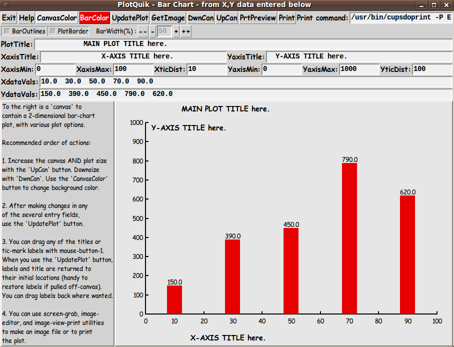
SCREENSHOTS of the GUI Finally, in 2017, I got around to converting (and vastly improving) some old 'feHandyTools' code for this 'bar chart' plot utility, and I ended up with the GUI seen in the following image. |
|
Note that when the GUI first comes up, it is populated with some sample titles and some sample x,y data --- as well as
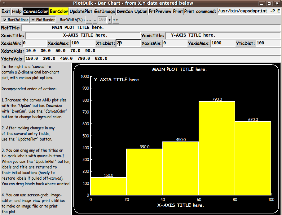
When the GUI starts up, this sample input is rendered as a bar chart in the canvas area. The title names indicate where the 3 types of titles initially appear on the GUI. The user can actually 'drag' these 3 titles around to different places on the GUI with a mouse. Just click on a title, hold down the button (button-1), and drag to a new position. Then release the button. In fact, you can 'whip' titles out-of-sight --- off an edge of the 'canvas'. If you want the titles back, you can simply click on the 'UpdatePlot' button. AND ... you can 'drag' the tic-mark labels. If you decided there are too many, you can 'whip' them off the canvas. You are not given the option to drag the bars (or the bar heights), because you could end up with a plot that is not in 'sync' with the x,y data shown in the two data entry fields of the GUI. BUT you can change the bars by simply changing the x,y data (or the x,y axis limits) and then clicking on the 'UpdatePlot' button. I could have used some 'real world' data instead of this 'generic' data. In fact, at the bottom of the script --- in the 'Additional GUI Initialization' section --- there are some other sample x,y data values (and titles and axis limits and tic-mark distances) that could be activated instead of this 'generic' data. --- The user has control of the 'domain' of the plot via the 'XaxisMin' and 'XaxisMax' entries. And the user has control of the 'range' of the plot via the 'YaxisMin' and 'YaxisMax' entries. The user has control of the tic-marking of the axes via the the 'XticDist' and 'YticDist' entries. --- To show some of the plot options:
Then I clicked on the 'UpdatePlot' button. The resulting GUI is shown in the image below. |
|
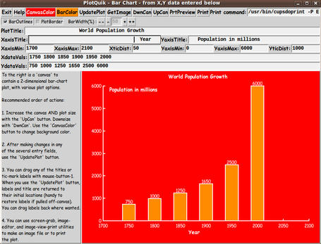
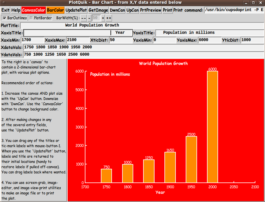
When we are all working on 'retina display' monitors --- resolution of more than 2000x1500 for desktop computers --- like WQXGA = 2560x1600 --- then the jaggies in angled line segments may be unnoticeable. The images above were captured on a 1024x768 monitor. I could (eventually) include a lot of code in the script to check for numeric input errors in the 8 numeric data 'entry' fields. I could adapt 'edit_inputs' and 'decimal_check' procs in Converter-Selector 'tkGooies' such as the tkWeightConvertSelect 'tkGooie' script. But for the initial release of this script, I decided to rely on the 'friendly' error messages that come from the Tcl-Tk 'wish' interpreter --- as demonstrated in an image on the PlotQuik Points(and Lines) from XY Data Entry page. A second data-set example To demonstrate some 'real world' data, I used some world population data (of humans) that was seen at the bottom of the PlotQuik Points(and Lines) from XY Data Entry page. That data ranged from year 0 to year 2000, but, for this bar chart example, I chose data in the 1750 to 2000 time frame, at 50 year intervals. For the following image:
Then I clicked on the 'UpdatePlot' button. The resulting GUI is shown in the image below. |
|
This bar chart shows the rather startling fact that the world population of humans 'exploded' in the 50 years between 1950 and 2000 --- it more than doubled. If we can expect the same in the 50 years between 2000 and 2050, the population will be over 12 BILLION in 2050. And you can expect a similar growth in heat-generating cars, heat-generating manufacturing furnaces and ovens, heat-generating oil field gas flares, heat-generating gas/coal/oil/diesel electricity generation, etc. etc. And there will be similar growth in the amount of sewage and trash being generated --- on land and in the sea and other waters. You think there is ocean-lake-river pollution now? ... Wait until 2050. You think there is global warming now? No wonder Earth scientists say 'the tipping point' is near. I am glad I won't be here in 2050. A third data-set example To demonstrate a data-set whose x-values are not evenly-spaced and are not matched by a nice, fixed x-tic-mark-distance, I used a dataset on Bison Population in the USA, in the 1700 to 2010 time frame. As noted at the bottom of the PlotQuik Points(and Lines) from XY Data Entry page, because non-human animals do not pay taxes, it is difficult to get copious data on their population numbers over the years. In this case, I had only 3 data points --- at 1700, 1870, and 2010 --- spaced 170 and 140 years apart. |
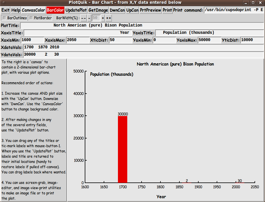
|
In this case, there were about 30 million bison in 1700. The 'wonderful' non-native people heading west wiped out so many bison by 1870 that only about 2 thousand were left --- resulting in a bar so small at 1870, compared to the 30-million bar, that the bar essentially coincides with the x-axis. Even though the bison population recovered somewhat by 2010 to about 30 thousand, the resulting bar also essentially coincides with the x-axis. Probably a large percentage of that 30 thousand is on the various ranches of Ted Turner. He has 'the largest herd in the world'. He seems to be doing a better job of preserving bison than the federal government --- even though he is serving up bison-burgers. Perhaps a line plot would guide the viewers gaze to the data points that are almost lying on the x-axis --- but when there is so little data in the intervening years, it seems that a line plot can be somewhat misleading in its own way. For example, the bison population may have dropped off almost exponentially between 1700 and 1870, rather than linearly. A few other features of the Bar Chart GUI The 'DwnCan' and 'UpCan' buttons can be used to decrease and increase the size of the canvas plot area. With each click, the plot is redrawn to fit nicely inside the new size of the canvas. --- The 'Help' button on the GUI can provide more extensive help than the brief guide on the left side of the GUI --- for example, to explain that the 'DwnCan' button may not work if the user has maximized the GUI window via the user's window manager --- or if the user repeatedly used the 'UpCan' button. Solution: Simply 'Unmaximize' the window with the 'Unmaximize' button (sometimes called the 'Restore' button) on the window-manager title bar. Then the 'DwnCan' button will work again. --- There are examples of use of the 'GetImage' button on some of the other 'PlotQuik' pages --- such as the PlotQuik Points(and Lines) from XY Data Entry page. --- I have discussed most of the buttons at the top of the GUI --- but not the 'Print' buttons. The 'Print' buttons create a Postscript file in a '/tmp' directory. The 'PrtPreview' button uses a PDF/Postscript viewer utility --- such as 'evince' --- to show the Postscript file that is created. And the 'Print' button uses a print-command --- shown in an 'entry' field at the top-right of the GUI --- to send the Postscript code to a user's printer. The temporary-files-directory, the PDF/Postscript viewer-command, and the print-command can be changed by the user who downloads this script by changing 3 variables in 'set' statements at the bottom of the script in the 'Additional GUI Initialization' section:
For the print command, I found that the program '/usr/bin/cupsdoprint' of the CUPS printing system worked quite nicely --- on my Ubuntu 9.10 Linux system --- with the set of parameters seen in this code. Not a Toy Note that this GUI is not meant to be a toy. Plots of science-engineering data, econometric data, biomedical data, social data, population data, etc. could be used to show that this GUI is meant to be an actual 'productivity' tool --- a free and open-source one. Although the quality of these plots could be outdone by software costing hundreds or thousands of dollars, this utility can generate good-quality plots QUICKLY --- to help get an idea across, QUICKLY. For free! DESCRIPTION OF THE CODE Below is the code that produced this GUI. I follow my usual 'canonical' structure for Tk code, for this Tk script: |
  0) Set general window & widget parms (win-name, win-position,
     win-color-scheme, fonts, widget-geometry-parms,
     text-array-for-labels-etc, win-size-control).

  1a) Define ALL frames and sub-frames.
  1b) Pack   ALL frames and sub-frames.

  2) Define & pack all widgets in the frames, frame by frame.
              Within each frame, define ALL the widgets.
              Then pack the widgets.

  3) Define keyboard or mouse/touchpad/touch-sensitive-screen
     action BINDINGS, if needed.

  4) Define PROCS, if needed.

  5) Additional GUI initialization (typically with one or more of
     the procs), if needed.
|
This Tk coding structure is discussed in more detail on the page A Canonical Structure for Tk Code --- and variations. This structure makes it easy for me to find code sections --- while generating and testing a Tk script, and when looking for code snippets to include from other scripts (code re-use). I call your attention to step-zero. One new thing that I started doing around 2014 is using a text-array for text in labels, buttons, and other widgets in the GUI. This can make it easier for people to internationalize my scripts. I will be using a text-array like this in most of my scripts in the future. All the 'set' statements for the text array, 'aRtext', are in one contiguous section toward the top of the code. Experimenting with the GUI As in all my scripts that use the 'pack' geometry manager (which is all of my 100-plus Tk scripts, so far), I provide the four main pack parameters --- '-side', '-anchor', '-fill', and '-expand' --- on ALL of the 'pack' commands for the frames and widgets. That helps me when I am initially testing the behavior of a GUI (the various widgets within it) as I resize the main window. I think I have found a good setting of the '-side', '-anchor', '-fill', and '-expand' parameters on the 'pack' commands for the various widgets of this GUI. In particular ... The 'canvas' widget expands/contracts appropriately when the window size is changed --- for example, during use of the 'DwnCan' and 'UpCan' buttons. Furthermore, 'button' and 'label' widgets stay fixed in size and relative-location as the window size is changed. Entry fields x-expand if the window x-expands. If anyone wants to change the way the GUI configures itself as the main window size is changed, they can experiment with the '-side', '-anchor', '-fill', and '-expand' parameters on the 'pack' commands for the various widgets --- to get the widget behavior that they want. --- Additional experimentation: You could change the fonts used for the various GUI widgets and plot titles. For example, you could change '-weight' from 'bold' to 'normal' --- or '-slant' from 'roman' to 'italic'. Or change font families. In fact, you may NEED to change the font families, because the families I used may not be available on your computer --- and the default font that the 'wish' interpreter chooses may not be very pleasing. I use variables to set geometry parameters of widgets --- parameters such as border-widths and padding. And I have included the '-relief' parameter on the definitions of frames and widgets. Feel free to experiment with those 'appearance' parameters as well. --- Note that the 'CanvasColor' and 'BarColor' buttons call on an RGB color-selector-GUI script to set the canvas background color and the color of the bars. You can make that color-selector script by downloading the code from the page offering 'a non-obfuscated color selector GUI', on this site. You can put that color-selector Tk script in the same directory with this script. Some features of the code There are plenty of comments in the code to describe what most of the code-sections are doing. See the 'PROCS' section of the code for a list of the procs that are used in this Tk script. The main plotting code is in the proc 'update_plot'. See the comments in that proc for details on how the plotting is implemented. Here is a quick view of how each of the procs are 'triggered'. |
   'update_plot'            - Called by the 'UpdatePlot' button --- and by
                              the 'downsize_canvas' and 'upsize_canvas' procs
                              --- and at the bottom of the script, in the
                              'Additional GUI Initialization' section.

   'set_margins'            - Called by the 'update_plot' proc.

   'get_deciPlaces'         - Called by the 'update_plot' proc.

   'format_deciPlaces'      - Called by the 'update_plot' proc.

'increment_barwidth_var'    - Called by the '--', '-', '+', and '++' buttons.

   'itemSelect'             - Called by a ButtonPress-1 binding on the canvas.

   'itemMove'               - Called by a Button1-Motion binding on the canvas.

   'draw_border'            - Called by the 'update_plot' proc --- if the
                              'Border' checkbutton is ON.

   'getSet_canvasColor'     - Called by the 'CanvasColor' button.

   'update_cancolor_button' - Called by proc 'getSet_canvasColor' and in the
                              'Additional GUI Initialization' section at
                              the bottom of this script.
                              Sets the background color of the 'CanvasColor'
                              button to the same color used for canvas background.

   'get_barColor'           - Called by the 'BarColor' button.

   'update_barcolor_button' - Called by proc 'get_barColor' and in the
                              'Additional GUI Initialization' section at
                              the bottom of this script.
                              Sets the background color of the 'BarColor'
                              button to the same color used for the bars.

   'set_plotColors'         - Called by the 'getSet_canvasColor' proc --- and
                              at the bottom of the script, in the
                              'Additional GUI Initialization' section.

   'blackORwhite_farthestFromHexRGBcolor'
                            - Called by the 'set_plotColors' proc.

   'augment_hexRGBcolor'    - Called by the 'set_plotColors' proc.

 Other, utility procs:

   'downsize_canvas'        - Called by the 'DwnCan' button.

   'upsize_canvas'          - Called by the 'UpCan' button.

   'resize_win'             - Called by the 'downsize_canvas' and
                              'upsize_canvas' procs.

   'getPut_image'           - Called by the 'GetImg' button.

   'print_preview'          - Called by the 'PrtPreview' button.

   'print_plot'             - Called by the 'Print' button.

   'popup_shortmsg'         - Called by the 'update_plot' proc and
                              potentially other procs.

   'popup_msgVarWithScroll' - Called by 'Help' button --- and potentially
                              within the 'popup_shortmsg' proc.
|
A fervent hope It is my hope that the copious comments in the code will help Tcl-Tk coding 'newbies' get started in making GUI's like this. Without the comments (especially in the 'update_plot' proc), the code might look too cryptic --- and potential young Tcler's might be tempted to return to their iPhones and iPads and iPods --- to seek out Trump's latest tweets --- to see what disgusting behavior he is exhibiting now:
What sub-humanoid characteristic is he going to demonstrate next? (So presidential!) Take a break from his horrible-ness. Try out the following code. THE CODE Here is a link to CODE for the script 'plotquik_BarChart_XYdataEntry.tk'. To browse the code, click on the link. To download it : With your web browser, you can 'right-click' on this link --- and in the menu that pops up, select an item like 'Save Link Target As ...' --- to save this file to your local computer. Then you can rename the file to remove the '.txt' suffix. Make sure that you have execute permission set on the file --- in order to execute the script. SOME POTENTIAL ENHANCEMENTS: Several possible enhancements come to mind, for this 'bar chart from x,y data entered on the GUI' utility:
Since I have not used this script for a large number of tests with widely varying ranges of data, there are probably some other enhancements that may be suggested by further usage. If I ever find that I am using this utility and I find that any of the features above are highly advisable to add or change (or implement in a different script), then I may return to this script to add/change/implement that feature. IN CONCLUSION As I have said on quite a few other Tcl-Tk code-donation pages on this site ... There's a lot to like about a utility that is 'free freedom' --- that is, no-cost and open-source so that you can modify/enhance/fix it without having to wait for someone else to do it for you (which may be never). A BIG THANK YOU to Ousterhout for starting Tcl-Tk, and a BIG THANK YOU to the Tcl-Tk developers and maintainers who have kept the simply MAH-velous 'wish' interpreter going. |
|
Bottom of the page for this To return to a previously visited web page location, click on the Back button of your web browser a sufficient number of times. OR, use the History-list option of your web browser. OR ...
< Go to Top of Page, above. >Page history:
This FE web page was created 2017 Oct 05.
If I ever post a copy of this code on the Tcler's Wiki site (wiki.tcl.tk) --- as a backup and alternative to this page, I plan to put a link to that page here. |