|
This Tk coding structure is discussed in more detail on the page
A Canonical Structure for Tk Code --- and variations.
This makes it easy for me to find code sections --- while generating
and testing this script, and when looking for code snippets to
include in other scripts (code re-use).
One new thing that I have added is the 'text-array-for-labels-etc'
item in section 0.
This can make it easier for people to 'internationalize'
my scripts.
I may be using a text-array like this in most of my scripts
in the future.
Experimenting with the GUI
As in all my scripts that use the 'pack' geometry manager (which
is all of my 100-plus scripts, so far), I provide the four main
'pack' parameters --- '-side', '-anchor', '-fill', '-expand'
--- on all of the 'pack' commands for the frames and widgets.
Tcler's can experiment with these 'pack' parameters if they
want to change the behavior of the GUI when window size is changed.
I think I have found a pretty good setting of the
'-side', '-anchor', '-fill', and '-expand' parameters on
the 'pack' commands for the various widgets of this GUI.
In particular ...
The 'canvas' and 'text' widgets expand/contract when the window
size is changed --- while button and label widgets stay
fixed in size and relative-location as the window size is changed.
However, I see one improvement I may make:
I may try using a 'fill-y' technique of some sort on the label
to the left of the 'scale' widget --- to make the label,
that is, its underlying image, expand in the y-direction
--- in order to cover some of the plain-color area with
a shaded image that matches the 'theme'.
---
Additional experimentation:
You might want to change the fonts used for the
various GUI widgets. For example, you could change '-weight'
from 'bold' to 'normal' --- or '-slant' from 'roman' to 'italic'.
Or change font families.
In fact, you may NEED to change the font families, because the families
I used may not be available on your computer --- and the default font
that the 'wish' interpreter chooses may not be very pleasing.
I use variables to set geometry parameters of widgets ---
parameters such as border-widths and padding.
And I have included the '-relief' parameter on the definitions
of frames and widgets.
Feel free to experiment with those 'appearance' parameters as well.
Features of the code
There are plenty of comments in the code, to describe
what most of the code-sections are doing.
The logic of the script gets rather 'interesting' as this is a GUI
that is intended to change its own appearance.
I have provided plenty of comments to help readers understand
the structure and intent of various code sections.
In particular, the comments are to help ME understand what I did,
when I look at this in the future to get code-ideas for
making enhanced Tk GUI's.
A major part of the code that is involved in setting a 'theme',
according to the radiobuttons setting, is in the proc
'change_theme'.
Comments in the Code
It is my hope that the copious comments in the code will
help Tcl-Tk coding 'newbies' get started in making GUI's like this.
Without the comments, the code might look quite unfriendly.
Without the comments, potential young Tcler's might be tempted to
return to their iPhones and iPads and iPods --- to watch BFHV
(Bulgaria's Funniest Home Videos).
The CODE
Here is a link to CODE for the Tk script
'demo_tkGUI_themes_using_ imagesANDcolors_ VER1.tk'.
Cropping Button Images
To provide the image background for the label widgets and
3 types of button widgets ('button', 'checkbutton', 'radiobutton'),
I use long buttons (more than 400 pixels wide and
about 24 to 28 pixels high).
I crop the 'base' images to a length suitable
to hold the text on the widgets.
We use the '-image' and '-compound' options to put
text-on-image on these 4 types of widgets.
Unfortunately, only the '-compound center' option
is available to put an image under the text.
This option does not allow us to position the text
on the image in any other location than the center.
This proves to create some problems --- in particular,
no easy way to left-align the text on the buttons.
CROPPING for 'button' vs. its cousins ---
'label', 'radiobutton', 'checkbutton'
I found a rather surprising difference in the
'cropping' capability of the 'button' widget
in comparison to its cousins --- the 'label', 'radiobutton',
and 'checkbutton' widgets.
I could provide the long 400-plus-pixel image filename
in the '-image' option of 'button' and simply crop the
image by using the '-width' parameter of button.
However, for the label, radiobutton, and checkbutton widgets,
the '-width' parameter would not perform the 'crop'.
I had to use 'image create' to create new
'image structures', for each widget, to which I could apply
a '-width' parameter --- to get an image to use in the
'-image' option of the label, radiobutton, and checkbutton widgets.
I suppose that the Tk developers did not notice this
difference because they have probably used the '-compound center'
(text-ON-image) option in a very small number of 'use-cases'.
Anyway, I am pleased to report that I was able to find a work-around.
SOME POSSIBLE ENHANCEMENTS
to improve the look
There are two things that stand out to me as areas where the GUI
'look' could be improved:
-
There seems to be no way to put an image-background behind the
'scale' widget (a TIP item for Tk 9.0?) --- for example, above
the 'trough', where the scale numbers are displayed. I may
need a 'workaround' for that.
-
The 'indicator-circle' on radiobuttons and the 'indicator-square'
on checkbuttons are problematic. It would be nice if we could
get the image under the text to extend under the 'indicators'.
---
In regard to the lack of an image behind the 'scale' widget:
There is a possible work-around.
One could make a scale-like widget from
a frame widget containing a label widget and 2 button widgets
Then one could use the '-image' option of the 'label' and 'button' widgets.
It's not ideal --- but at least, for those who find the
'scale-without-an-image-background' ugly, there is an
opportunity to reduce the ugliness.
---
In regard to the lack of an image behind the 'indicators'
on the radiobutton and checkbutton widgets:
I have made progress in getting an image behind both
the text and the radiobutton and checkbutton 'indicators'.
If provide code and a description on a
Version 2 of this 'Embellished Tk GUI Widgets' page.
See the improved GUI image on that page.
---
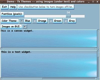
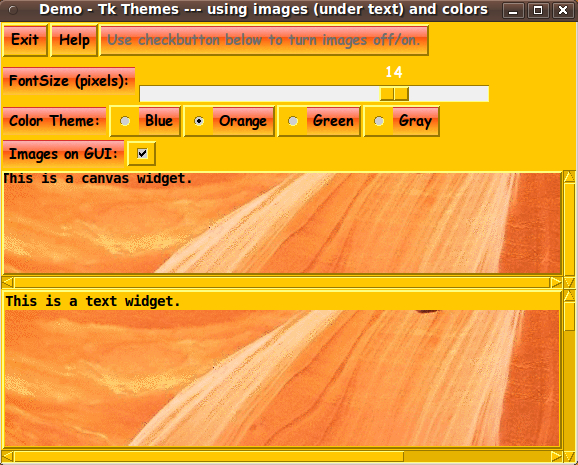
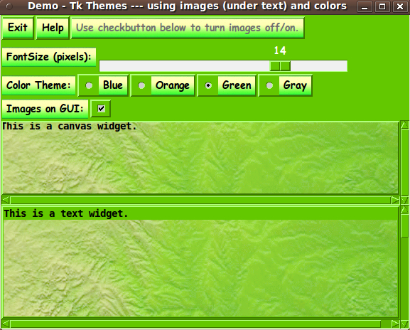
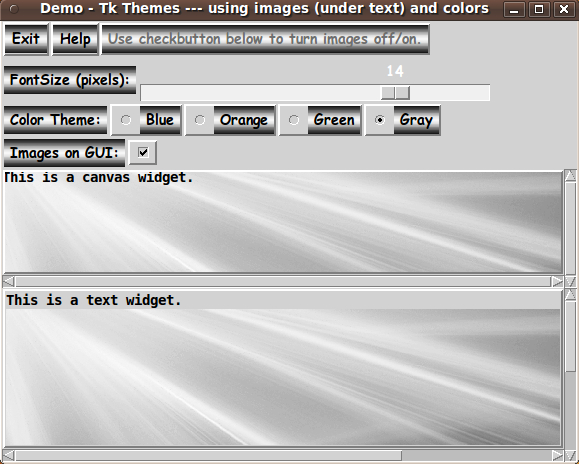
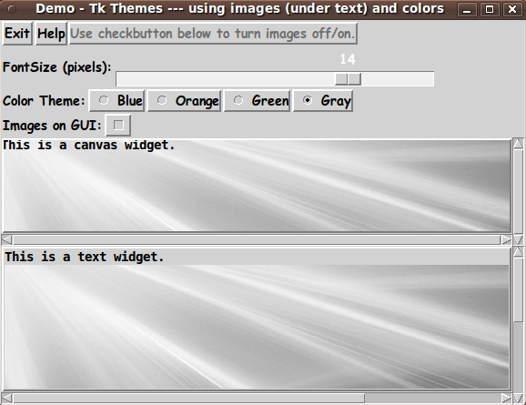
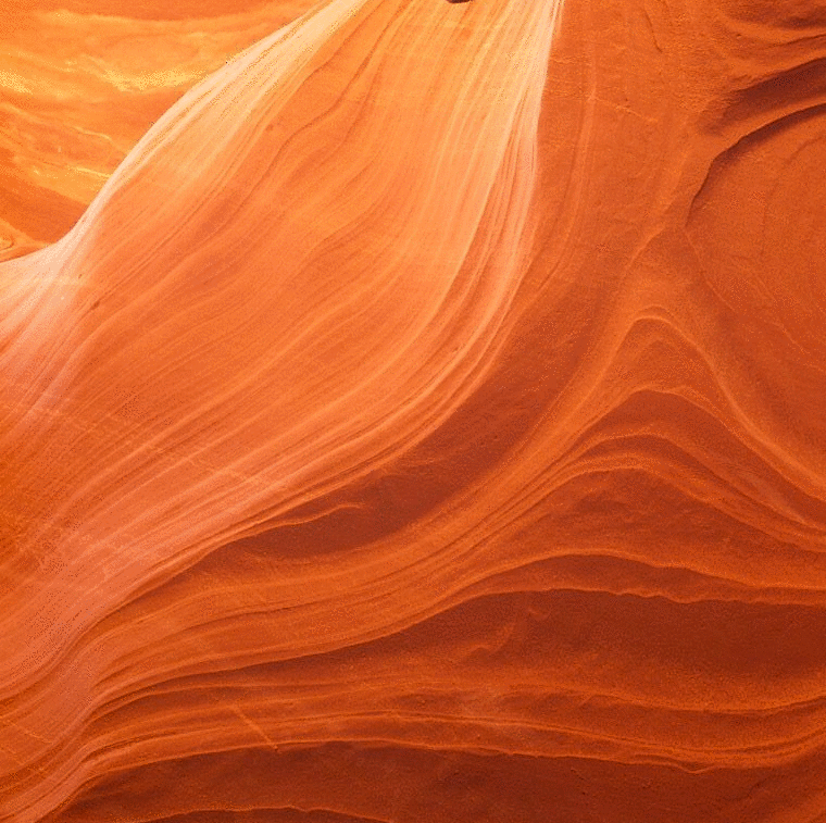
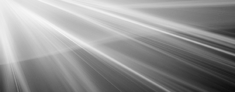
P.S. - On the image files used for the demo:
I have posted (below) the 8 images (GIF files) that
I used to make the blue, orange, green, and gray test themes.
First, here are four images to be cropped for 'button'
backgrounds.
|