FE 'tkGooie' Utilities'PLOTtools' group
'PlotQuik'
|
The FE 'PlotQuik' Lines-and/or-Points 'tkGooie' plot utility --- that reads data from columns in a text file. The FE Color Selector GUI is shown here as the user starts to change the background color of the plot. |
FE Home Page >
FE Downloads Page >
FE 'tkGooies' Description Page >
FE 'tkGooies' 'PLOTtools' Page >
This PlotQuik from 2-or-3 columns of data Page
INTRODUCTION to the On a page about a 'PlotQuik' utility nicknamed PlotQuik_PointsLines_XYdataEntry, I explained that I am in the process of creating 5 'PlotQuik' utilities:
These utilities are intended for the 'PLOTtools' toolchest of an FE menu (or 'toolchest') system called 'tkGooies'. The 'PlotQuik' page mentioned above (link above) explains the background of these utilities --- which involves FE (Freedom Environment) Tcl-Tk programming in the the 2011 to 2017 time frame. In short, 'PlotQuik' utilities 1 and 2 and 3 and 4 were published on this FE web site at
This page presents the code for the 5th 'PlotQuik' utility listed above -- the 'PlotQuik' utility for making a lines-and/or-points plot from 2 or 3 columns of data in a text file containing columnar data. A description of that code (and the GUI that it produces) follows. THE GUI DESIGN Following a Tk GUI design procedure that I started using around 2015, I make a 'text-sketch' of the layout of the GUI --- to help plan how the GUI will be implemented. In the below sketch of the GUI: |
SQUARE BRACKETS indicate a comment (not to be placed on the GUI).
BRACES indicate a Tk 'button' widget.
A COLON indicates that the text before the colon is on a 'label' widget.
UNDERSCORES indicate a Tk 'entry' widget.
CAPITAL-X indicates a Tk 'checkbutton' widget.
CAPITAL-O indicates a Tk 'radiobutton' widget (if any).
<----O----> indicates a horizontal Tk 'scale' widget (if any).
The options available to the user are indicated by the following 'sketch' of the GUI: |
FRAMEnames
VVVVVVVVVV
-----------------------------------------------------------------------------------
tkPlotQuik - lines or points from 2 or 3 columns of data in a text file
[window title]
-----------------------------------------------------------------------------------
.fRbuttons {Exit}{Help}{CanvasColor}{UpdatePlot}{GetImage}{DwnCan}{UpCan}{PrtPreview}{Print} [entry field here
shows a print command]
.fRopts X DataLines X DataPoints X PlotBorder X SameAxisUnits for Y1 & Y2
[a grayed-out checkbutton, to emphasize same axis is used for y1 & y2]
.fRfile {(Re)ReadFile} Data filename: ____________________________________________________________________{Browse4file}
.fRtitle_main Plot title: __________________________________________________________________________________________________
.fRtitles_xy XaxisTitle:____________________________________________ YaxisTitle:___________________________________________
.fRlims_x Xcolnum: ___ XaxisMin: _______________ XaxisMax: _______________ XticDist:_______________
.fRlims_y1 Y1colnum: ___ YaxisMin: _______________ YaxisMax: _______________ YticDist:_______________
.fRlims_y2 Y2colnum: ___
.fRlow .fRlow.fRmsg .fRlow.fRplot
[ an area here contains a guide [ an area here
in a text or label widget contains a canvas widget
... ...
many to be populated with
... ...
lines 'items' whenever the 'UpdatePlot' button
... ...
deep. in frame 'fRbuttons' is poked.
] ]
GUI components: From the GUI 'sketch' above, it is seen that the GUI consists of about
This utility is 'Quik' in two ways:
SCREENSHOTS of the GUI Finally, in 2017, I got around to converting (and vastly improving) some old 'feHandyTools' code for this 'plot 2 or 3 columns of data from a file' plot utility, and I ended up with the GUI seen in the following image. |
Note that when the GUI first comes up, I have not initialized the filename entry field with a sample filename. Typically, the user will click on the 'Browse4File' button and use a Tcl-Tk 'tk_getOpenFile' dialog to navigate to a directory ('folder') and select a file for plotting. Alternatively, the user does not have to use the 'Browse4File' button. The user can use a file-manager GUI on their computer to navigate to the file to be plotted, and then 'copy-and-paste' the filename from that file-manager GUI into the filename 'entry' field on this 'tkGooie'. I could have used some files of 'real world' data instead of leaving the filename entry field blank. In fact, at the bottom of the script --- in the 'Additional GUI Initialization' section --- there are some references to several sample data files --- and here are links to several files --- so that you can see the type of input read by this utility. Click on one of these links to view the file. To download it (to use as sample input data), you can 'right-click' on a link --- and in the popup menu that appears, choose an option like 'Save Link Target As...'. Although the filename entry field is blank, many of the other entry fields contain some sample data --- to indicate what is expected in those fields. --- Note the 3 'colnum' entry fields below the filename entry field. You can use those fields to select the columns of data to use for the x-data and the y1-data --- and optional y2-data. In many cases, the x-data is in column 1 and the y1-data is in column 2 and there is no y2-data to be plotted --- so the GUI starts up with 1 in the 'Xcolnum' entry field and 2 in the 'Y1colnum' entry field --- and the 'Y2colnum' entry field left blank. You will need to set the 'colnum' entry fields according to the data file that you selected. THEN ... you click on the '(Re)ReadFile' button to read the data --- from the file you selected and from the columns that you specified. Here is a screen image that shows how a small window pops up giving a summary of the data that was read. |
In this case, a file of 'USA Life Expectancy data' was selected. That is the first of the 3 sample data files provided at links above. If you look at the contents of that file, you will see that it contains 2 columns of data --- as the prefix 'DATA2cols' on the filename implies. The popup 'data statistics' window shows that there were 8 data records read from the file. So there will be 8 data points in the subsequent plots. There were a total of 21 records (lines) read from the file --- 13 comment lines and 8 data lines. The GUI image shows that column 1 was used to get the X-data and column 2 to get the Y1-data. The popup 'data statistics' window shows the min and max of the X-data and the Y1-data. --- It would be rather tedious to have to type a title in the 3 'title entry' fields of the GUI ... SO ... When the file is read, the first 3 comment records ('#' in column 1) are used to load those 3 entry fields:
--- The 'read operation' does not do the plot --- but the 'read_data' proc includes some code to put 'suggested' values in the 'entry' fields for 'XaxisMin', 'XaxisMax', 'XticDist' and for 'YaxisMin', 'YaxisMax', 'YticDist'. These 'suggested' values are rather 'generous'. Before clicking on the 'UpdatePlot' button, the user could use the 'MIN:' and 'MAX:' values shown in the 'data statistics' popup-window to 'tighten up' the X and Y axis limits. Or you can simply 'go with' the 'suggested' values. A click on the 'UpdatePlot' yielded the following plot on the GUI --- using the 'suggested' axis-limits values. |
The 'XticDist' and 'YticDist' entry field values were used to generate the tic-marks on the axes. You can use those 'ticDist' entries to control how many decimal places are used in the tic-mark-labels. For example, if we had used 100.0 instead of 100 for the 'XticDist', the X-tic-mark-labels would have looked like 1500.0, 1600.0, 1700.0, ... Since the X and Y axis limits looked rather 'generous' --- leaving a lot of room around the plot of the data lines --- I decided to 'adjust' the limits --- and the following image shows the result --- after also using the 'CanvasColor' button to set the canvas background color to black --- and after setting the 'DataPoints' checkbutton to ON. |
If you were going to print this image, you would probably want to set the canvas background color to WHITE --- RGB(255,255,255) --- to save on ink. If you wanted this plot in an image file --- say, for use in web pages or emails --- then you could do the following.
The images above do not show an example of selecting 3 columns of data from a file. Following is an example of using the 3rd sample data file in the links above --- a file containing population growth data for two cities --- London and Los Angeles. To read that file, the 'colnum' entry fields of the GUI were set to 1, 2, and 3. For this plot, the 'DataPoints' checkbutton was set to ON. And the following image resulted after doing some adjustments to the 'XaxisMin', 'XaxisMax', 'YaxisMin', and 'YaxisMax' entry fields --- and then clicking on the 'UpdatePlot' button. |
You can get the plot and axis titles positioned close to where you want them by using leading spaces in the title entry fields. To position the titles exactly where wanted, the user can actually 'drag' the 3 titles around to different places on the 'canvas' with a mouse. Just click on a title, hold down the button (button-1), and drag to a new position. Then release the button. In fact, you can 'whip' titles out-of-sight --- off an edge of the 'canvas'. If you want the titles back, you can simply click on the 'UpdatePlot' button. AND ... you can 'drag' the tic-mark labels. If you decided there are too many, you can 'whip' some off the canvas. You are NOT given the option to drag the data lines (or data points), because you could end up with a plot that is not in 'sync' with the x,y data in the data file. BUT you can:
--- The user has control of the 'domain' of the plot via the 'XaxisMin' and 'XaxisMax' entries. And the user has control of the 'range' of the plot via the 'YaxisMin' and 'YaxisMax' entries. The user has control of the tic-marking of the axes via the the 'XticDist' and 'YticDist' entries. --- I could (eventually) include a lot of code in the script to check for numeric input errors in the 9 numeric data 'entry' fields. I could adapt 'edit_inputs' and 'decimal_check' procs in Converter-Selector 'tkGooies' such as the tkWeightConvertSelect 'tkGooie' script. But for the initial release of this script, I decided to rely on the 'friendly' error messages that come from the Tcl-Tk 'wish' interpreter --- as demonstrated in an image on the PlotQuik Points(and Lines) from XY Data Entry page. --- To set the canvas background color to black in a previous image: I clicked on the 'CanvasColor' button and used an RGB color selector GUI (a 'SELECTORtools' 'tkGooie' script presented on another web page) to change the canvas background color to black --- RGB(0,0,0) --- instead of light-gray. Choosing this dark background for the canvas caused the color for text (titles and tick-mark labels) and lines (axes and tic-marks and data-lines) to be changed automatically from black to white. Another data-set example To demonstrate some more 'real world' data (and color changing), I used some world population data (of humans) that was seen in a plot at the bottom of the PlotQuik Points(and Lines) from XY Data Entry page. That data ranged from year 0 to year 2000. That data is in the 2nd file of the sample-data-file links above. For the following image:
A click on the 'UpdatePlot' button resulted in the image below. |
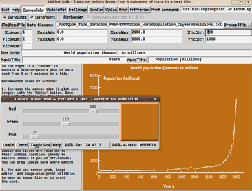
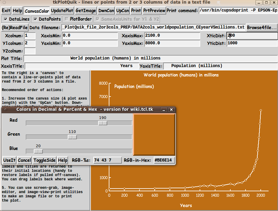
In some of my other 'tkGooies', I have displayed the current RGB color setting of a color, such as the canvas background color, in a label on the GUI --- as a hex string such as 'ffffff' for white. I did not do that for this GUI. But I captured an image of the 'RGB Color Selector' GUI in the image above --- to demonstrate that you can click on the 'CanvasColor' button at any time, and the RGB color selector GUI will come up with all the settings on the GUI showing the current background color of the canvas --- in RGB decimal, hex, and as percentages. A few comments on the 'word-pop' data: If you look carefully at the right side of the plot, you can see that the population of humans on Earth more than doubled in the last 50 years --- about 1950 to 2000. If we can expect the same in the 50 years between 2000 and 2050, the population will be over 12 BILLION in 2050. And you can expect a similar growth in heat-generating cars, heat-generating manufacturing furnaces and ovens, heat-generating oil field gas flares, heat-generating gas/coal/oil/diesel electricity generation, etc. etc. You think global warming is a hoax? No wonder Earth scientists say 'the tipping point' is near. I am glad I won't be here in 2050. Furthermore, there will be similar growth in the amount of sewage and trash being generated --- on land and in the sea and other waters. You think there is ocean-lake-river pollution now? ... Wait until 2050. In fact, I chose the background color BROWN for this plot --- to emulate the color of most of the lakes and rivers and seas on Earth, in the year 2050. It's already like that near Rio de Janiero, Brazil --- as the 2016 Summer Olympics showed us. Swimmers and divers and kayakers were risking serious infections.
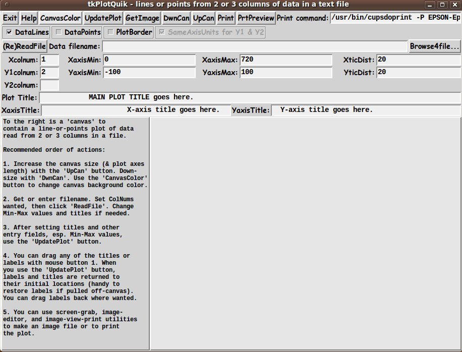
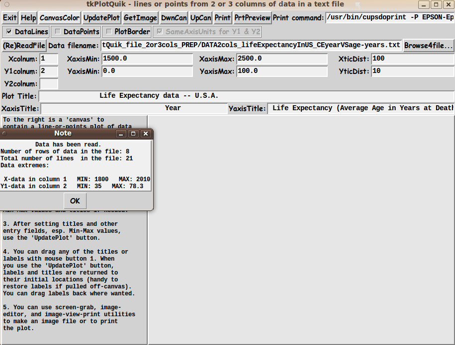
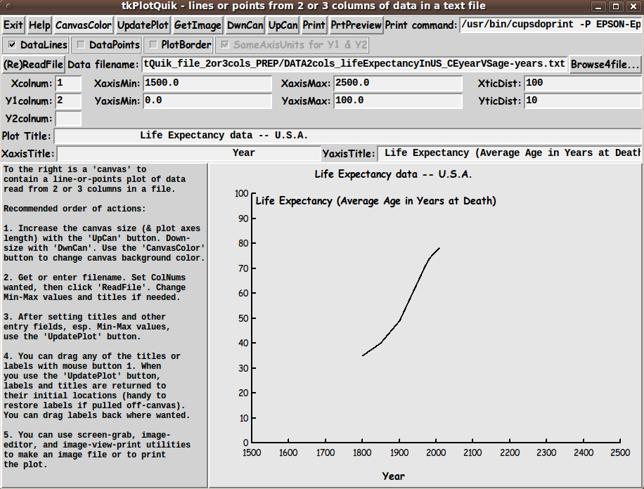
A few other features of the The 'DwnCan' and 'UpCan' buttons can be used to decrease and increase the size of the canvas plot area. With each click, the plot is redrawn to fit nicely inside the new size of the canvas. --- The 'Help' button on the GUI can provide more extensive help than the brief guide on the left side of the GUI --- for example, to explain that the 'DwnCan' button may not work if the user has maximized the GUI window via the user's window manager --- or if the user repeatedly used the 'UpCan' button. Solution: Simply 'Unmaximize' the window with the 'Unmaximize' button (sometimes called the 'Restore' button) on the window-manager title bar. Then the 'DwnCan' button will work again. --- There are examples of use of the 'GetImage' button on some of the other 'PlotQuik' pages --- such as the PlotQuik Points(and Lines) from XY Data Entry page. --- I have discussed most of the buttons at the top of the GUI --- but not the 'Print' buttons. The 'Print' buttons create a Postscript file in a '/tmp' directory. The 'PrtPreview' button uses a PDF/Postscript viewer utility --- such as 'evince' --- to show the Postscript file that is created. And the 'Print' button uses a print-command --- shown in an 'entry' field at the top-right of the GUI --- to send the Postscript code to a user's printer. The temporary-files-directory, the PDF/Postscript viewer-command, and the print-command can be changed by the user who downloads this script by changing 3 variables in 'set' statements at the bottom of the script in the 'Additional GUI Initialization' section:
For the print command, I found that the program '/usr/bin/cupsdoprint' of the CUPS printing system worked quite nicely --- on my Ubuntu 9.10 Linux system --- with the set of parameters seen in this code. Not a Toy Note that this GUI is not meant to be a toy. Plots of science-engineering data, econometric data, biomedical data, social data, population data, etc. could be used to show that this GUI is meant to be an actual 'productivity' tool --- a free and open-source one. Although the quality of these plots could be outdone by software costing hundreds or thousands of dollars, this utility can generate good-quality plots QUICKLY --- to help get an idea across, QUICKLY. For free! DESCRIPTION OF THE CODE Below is the code that produced this GUI. I follow my usual 'canonical' structure for Tk code, for this Tk script: |
0) Set general window & widget parms (win-name, win-position,
win-color-scheme, fonts, widget-geometry-parms,
text-array-for-labels-etc, win-size-control).
1a) Define ALL frames and sub-frames.
1b) Pack ALL frames and sub-frames.
2) Define & pack all widgets in the frames, frame by frame.
Within each frame, define ALL the widgets.
Then pack the widgets.
3) Define keyboard or mouse/touchpad/touch-sensitive-screen
action BINDINGS, if needed.
4) Define PROCS, if needed.
5) Additional GUI initialization (typically with one or more of
the procs), if needed.
This Tk coding structure is discussed in more detail on the page A Canonical Structure for Tk Code --- and variations. This structure makes it easy for me to find code sections --- while generating and testing a Tk script, and when looking for code snippets to include from other scripts (code re-use). I call your attention to step-zero. One new thing that I started doing around 2014 is using a text-array for text in labels, buttons, and other widgets in the GUI. This can make it easier for people to internationalize my scripts. I will be using a text-array like this in most of my scripts in the future. All the 'set' statements for the text array, 'aRtext', are in one contiguous section toward the top of the code. Experimenting with the GUI As in all my scripts that use the 'pack' geometry manager (which is all of my 100-plus Tk scripts, so far), I provide the four main pack parameters --- '-side', '-anchor', '-fill', and '-expand' --- on ALL of the 'pack' commands for the frames and widgets. That helps me when I am initially testing the behavior of a GUI (the various widgets within it) as I resize the main window. I think I have found a good setting of the '-side', '-anchor', '-fill', and '-expand' parameters on the 'pack' commands for the various widgets of this GUI. In particular ... The 'canvas' widget expands/contracts appropriately when the window size is changed --- for example, during use of the 'DwnCan' and 'UpCan' buttons. Furthermore, 'button' and 'label' widgets stay fixed in size and relative-location as the window size is changed. Entry fields x-expand if the window x-expands. If anyone wants to change the way the GUI configures itself as the main window size is changed, they can experiment with the '-side', '-anchor', '-fill', and '-expand' parameters on the 'pack' commands for the various widgets --- to get the widget behavior that they want. --- Additional experimentation: You could change the fonts used for the various GUI widgets and plot titles. For example, you could change '-weight' from 'bold' to 'normal' --- or '-slant' from 'roman' to 'italic'. Or change font families. In fact, you may NEED to change the font families, because the families I used may not be available on your computer --- and the default font that the 'wish' interpreter chooses may not be very pleasing. I use variables to set geometry parameters of widgets --- parameters such as border-widths and padding. And I have included the '-relief' parameter on the definitions of frames and widgets. Feel free to experiment with those 'appearance' parameters as well. --- Note that the 'CanvasColor' button calls on an RGB color-selector-GUI script to set the canvas background color. You can make that color-selector script by downloading the code from the page offering 'a non-obfuscated RGB color selector GUI', on this site. You can put that color-selector Tk script in the same directory with this script. Some features of the code There are plenty of comments in the code to describe what most of the code-sections are doing. See the 'PROCS' section of the code for a list of the procs that are used in this Tk script. The main plotting code is in the proc 'update_plot'. See the comments in that proc for details on how the plotting is implemented. Here is a quick view of how each of the procs are 'triggered'. |
'find_file' - Called by the 'Browse4File' button.
'read_data' - Called by the '(Re)ReadFile' button.
'set_lims_ticdist' - Called by proc 'read_data', twice --- for
x-axis and for y-axis.
'set_nice_upper_bound' - Called by proc 'set_lims_ticdist'.
'set_nice_lower_bound' - Called by proc 'set_lims_ticdist'.
'update_plot' - Called by the 'UpdatePlot' button --- and by
the 'downsize_canvas' and 'upsize_canvas' procs
--- and at the bottom of the script, in the
'Additional GUI Initialization' section.
'set_margins' - Called by the 'update_plot' proc.
'get_deciPlaces' - Called by the 'update_plot' proc.
'format_deciPlaces' - Called by the 'update_plot' proc.
'itemSelect' - Called by a ButtonPress-1 binding on the canvas.
'itemMove' - Called by a Button1-Motion binding on the canvas.
'draw_border' - Called by the 'update_plot' proc --- if the
'Border' checkbutton is ON.
'getSet_canvasColor' - Called by the 'CanvasColor' button.
'update_cancolor_button' - Called by proc 'getSet_canvasColor' and in the
'Additional GUI Initialization' section at
the bottom of this script.
Sets the background color of the 'CanvasColor'
button to the same color used for the canvas background.
'set_plotColors' - Called by the 'getSet_canvasColor' proc --- and
at the bottom of the script, in the
'Additional GUI Initialization' section.
'blackORwhite_farthestFromHexRGBcolor'
- Called by the 'set_plotColors' proc.
'augment_hexRGBcolor' - Called by the 'set_plotColors' proc.
Other, utility procs:
'downsize_canvas' - Called by the 'DwnCan' button.
'upsize_canvas' - Called by the 'UpCan' button.
'resize_win' - Called by the 'downsize_canvas' and
'upsize_canvas' procs.
'getPut_image' - Called by the 'GetImage' button.
'print_preview' - Called by the 'PrtPreview' button.
'print_plot' - Called by the 'Print' button.
'popup_shortmsg' - Called by the 'update_plot' proc and
potentially other procs.
'popup_msgVarWithScroll' - Called by 'Help' button --- and potentially
within the 'popup_shortmsg' proc.
A fervent hope It is my hope that the copious comments in the code will help Tcl-Tk coding 'newbies' get started in making GUI's like this. Without the comments (especially in the 'update_plot' proc), the code might look too cryptic --- and potential young Tcler's might be tempted to return to their iPhones and iPads and iPods --- to seek out Trump's latest tweets --- to see if he is at the point yet of taking the USA and the world down with him. He is mad (= ego-maniacal) enough to reach a point where he would destroy the world because "if I'm going down, I'm going to take the world with me". Take a break from our evolving rendezvous with a natural end-point to Trump's extreme ego-mania. Try out the following code. THE CODE Here is a link to CODE for the script 'plotquik_LinesPoints_XYdataFromFile2or3cols.tk'. To browse the code, click on the link. To download it : With your web browser, you can 'right-click' on this link --- and in the menu that pops up, select an item like 'Save Link Target As ...' --- to save this file to your local computer. Then you can rename the file to remove the '.txt' suffix. Make sure that you have execute permission set on the file --- in order to execute the script. SOME POTENTIAL ENHANCEMENTS: Several possible enhancements come to mind, for this 'plot 2 or 3 columns of data from a text file' utility:
Since I have not used this script for a large number of tests with widely varying ranges of data, there are probably some other enhancements (and fixes) that may be suggested by further usage. If I ever find that I am using this utility and I find that any of the features above are highly advisable to add or change (or implement in a different script), then I may return to this script to add/change/implement that feature.
NOTE: (2018 May 24):
These improvements are to be made in a future release. In addition, a separate plot utility may be 'forked' from this plot utility --- to facilitate doing 'cumulative' and 'cumulative-percent' plots with the columnar data. Making that a separate plot utility will avoid making this plot utility too confusing and cumbersome. Also, the separate plot utility will allow for experimenting with some alternate forms of the GUI interface. IN CONCLUSION As I have said on quite a few other Tcl-Tk code-donation pages on this site ... There's a lot to like about a utility that is 'free freedom' --- that is, no-cost and open-source so that you can modify/enhance/fix it without having to wait for someone else to do it for you (which may be never). A BIG THANK YOU to Ousterhout for starting Tcl-Tk, and a BIG THANK YOU to the Tcl-Tk developers and maintainers who have kept the simply MAH-velous 'wish' interpreter going. |
Bottom of this page for the 'tkGooie'
To return to a previously visited web page location, click on the
Back button of your web browser a sufficient number of times.
OR, use the History-list option of your web browser.
< Go to Top of Page, above. >Page history:
This FE web page was created 2017 Oct 08.
If I ever post a copy of this code on the Tcler's Wiki site (wiki.tcl.tk) --- as a backup and alternative to this page, I plan to put a link to that page here. |