FE 'tkGooie' Utilities

'PLOTtools' group

tkGnuplotXY _BarChart _fromFile

a GUI 'front-end' for 'gnuplot'

(FE = Freedom Environment)

A bar plot from
this FE 'tkGooie'
'front end' to 'gnuplot'
---
from data read from
user-specified
data columns of
a specified file

FE Home Page > FE Downloads Page >

FE 'tkGooies' Description Page >

FE 'tkGooies' 'PLOTtools' Menu >

This 'tkGnuplotXY _BarChart _fromFile'
tkGooie code Page

INTRODUCTION to
Tcl-Tk code for a
'tkGnuplotXY_BarChart_fromFile' app

In 2015 October, I provided several Tk scripts that use 'gnuplot' to

and

and

On those pages, I pointed out that it may be 2016 or so before I get around to getting some auto-plot-scaling and auto-ticmarking code into releasable form --- in some pure-Tcl-Tk 'PlotQuik' X-Y plotting scripts that are on my 'to-do' list.

I need to make that autoscale and auto-ticmarking code more robust (and modular).

So, as a relatively quick-to-implement alternative, I decided to make some Tk GUI 'front-ends' for the popular, widely-available 'gnuplot' program --- some plot utilities for

  1. XY plots of 2 or 3 columns of data from a data file

  2. XY plots from math expressions of the form f(x)

  3. 3D surface plots from math expressions of the form f(x,y)

  4. bar charts from a data file

  5. one or two other 'gnuplot' front ends

The three Tk scripts for items 1, 2, and 3 above are posted in the pages whose links are above.

On this page, I present the code of a Tk script for item 4 above.

The code is presented further below.


THE GOALS

I had some general goals for the Tcl-Tk 'front-end' script for this GUI. Those goals were shaped by the capabilities of the 'gnuplot' program with regard to doing 'bar chart' plots from data files with columns of data.

In 'gnuplot' terminology, a 'bar chart' is a 'histogram plot'.

Note that in making bar charts, the x-axis may not be numeric.

The tic-marks along the x-axis may be names of people or names of budget categories.

And when the x-axis is numeric (such as years), you will generally want the x-axis values to have a fixed interval between the values --- so that the graph does not look distorted (and misleading) in the x-direction.

When you want to plot multiple columns of data against the x-tic-mark values/names, there are some options in plotting the bars --- basically 'clustered' bars or 'stacked' bars.

And there are various options for the bars:

  • fill type: pattern or solid-color

  • gap between clusters of bars

  • bar width of stacked bars

'gnuplot' is capable of automatically determining nice default geometry for the bars and the axes.

With 'clustered' bar plots, you can use a gap-width parameter (for the gap between the clusters) to determine the width of individual bars in the clusters --- the bigger the gap specified, the narrower the bars that 'gnuplot' draws.

And with 'stacked' bar plots, you can use a bar-width parameter to specify a width for the bars (which also determines a gap between those stacked bars).

Since there are so many choices and parameters involved in performing a bar plot, I did a web search to find several types of example gnuplot scripts --- in order to glean from them the set of gnuplot parameters on which I needed to concentrate.

As I proceeded to try out these sample gnuplot 'histogram' scripts, my knowledge of the capabilities of 'gnuplot' with regard to bar chart plotting advanced --- and I augmented or altered some of my initial goals. Here are the main goals to which I gravitated for this Tk GUI.

  • Provide an entry field for a file name --- and a 'GetFilename' button --- to use the Tcl-Tk 'tk_getOpenFile' utility to provide a way to navigate a directory structure to select a data file.

  • Provide 3 entry fields so that the user can tailor the plot title, and the x-axis and y-axis titles, as desired.

    (By adjusting leading spaces in these titles, the user may have some control on the placement of those titles on the plot.)

  • Provide a row of buttons at the top of the GUI with labels such as 'Exit', 'Help', 'RePlot', and one or more color buttons to allow for setting some color options that are available with 'gnuplot'.

  • Provide 4 entry fields so that the user can specify min and max values for the x and y axis scales.

    (Initialize each of these fields to an asterisk ... * ... which is to signal to 'gnuplot' to autoscale --- i.e. tells 'gnuplot' to automatically choose the min and max axis-extent values --- those mins and maxes which are indicated by an asterisk instead of a number.)

  • Provide a pair of radiobuttons by which to specify whether to fill the bars with a pattern or with a solid-color.

  • Provide a pair of radiobuttons by which to specify whether to do a 'side-by-side' plot or a 'stacked' plot.

  • Provide a pair of entry fields for gap-width and bar-width --- and enable one for the other depending on whether 'side-by-side' plot or 'stacked' plot is chosen.

  • Provide radiobuttons for some of the output ('terminal type') options of 'gnuplot' --- GIF, PNG, JPEG, PS (Postscript color), PSbw (Postscript black-and-white), SVG (Scalable Vector Graphics), and WXT (a high-quality terminal type).

    In addition, provide a 'TestImg' button next to these radiobuttons, to take advantage of a 'gnuplot' ability to put out a 'test image' for any of the 'terminal types' --- showing the line-types and text orientation options and other options for the terminal type.

  • Provide 2 entry fields by which to specify the size of the image output (x-pixels, y-pixels).


THE GUI LAYOUT

Like for some other Tk GUI scripts that I posted here at freedomenv.com, I made an initial 'text-sketch' for the GUI for this 'gnuplot' 'front-end' utility.


  CONVENTIONS for the GUI 'text-sketch' below:

   * SQUARE-BRACKETS indicate a comment not to be included on the GUI.
   * BRACES indicate a Tk 'button' widget.
   * UNDERSCORES indicate a Tk 'entry' widget.
   * A COLON indicates that the text before the colon is on a 'label' widget.
   * CAPITAL-O indicates a Tk 'radiobutton' widget.
   * CAPITAL-X indicates a Tk 'checkbutton' widget (if any).
   * Vertical bars (and horizontal hyphens) outline a 'listbox' widget.
   * Less-than and greater-than signs indicate the left and right ends of a horizontal 'scrollbar'.
   * Capital-V and Capital-A letters indicate the bottom and top ends of a vertical 'scrollbar'.


  Here is the sketch:


  FRAMEnames
  VVVVVVVVVV
              ------------------------------------------------------------------------------------------
              Gnuplot of one or more columns from a data file - as BARS on a chart:
              [window title]
              ------------------------------------------------------------------------------------------

  .fRbuttons  {Exit} {Help} {RePlot}   {Color of      X ColHeadLineInFile?
                                        background}

  .fRfile      Data Filename: _______________________________________________  {GetFilename} {ViewTextFile}

  .fRtitle     Plot title: _________________Plot title goes here._____________________________________________________

  .fRxaxis     XaxisMin: 1.0___ XaxisMax: 10.0___ XticLabelsCol#: 1_                  _____X-axis label goes here____

  .fRyaxis     YaxisMin: *_____ YaxisMax: *______ YColumn(s)ToPlot: 2_______________  _____Y-axis label goes here___
                                                   ["Enter more than 1 column# for a cluster plot."]
                              [Could popup this msg when mouse cursor enters the Ycols entry field.]
                                                                                
  .fRplotopts  BarFill:  O Pattern  O SolidColor    BarPlotType: O SideBySide  O Stack   Gap: 2.0_  BarWidth: 0.5_ 

  .fRtics      XticLabelsAngle: ___  YticLabelsAngle: ___ 

  .fRoutopts   Image file type: O GIF O PNG O JPG O PSc O PSbw O SVG O WXT {TestImg}  Xpixels: 800__   Ypixels: 600__  

  .fRmsg        [ ..........  Messages go here  ......................................................]


From the GUI 'sketch' above, it is seen that the GUI is to consist of about

  • 7 button widgets
  • 18 label widgets
  • 16 entry widgets
  • 11 radiobutton widgets in 3 groups
  • 1 checkbutton widgets
  • 0 listbox widgets
  • 0 text widgets
  • 0 scale widgets
  • 0 canvas widgets

Here is an image of the GUI that I ended up with for a 'first release'.


Poke this image to see the image
in a separate window or tab.

Note the initial message at the bottom of the GUI, indicating that the user can immediately get a plot by simply clicking on the 'RePlot' button.

    (A sample data file is provided in the directory with this Tk GUI script, and the data filename is initially in the filename entry field.)

After you do a plot, you typically see the names of a couple of files (the gnuplot script file and an output image file, if any) in the message line at the bottom of the GUI.

The 4 min,max entry fields are defaulted to an asterisk, which is used to tell 'gnuplot' to automatically determine those 4 limits.

As I use this utility, I may find that I want to alter the GUI somewhat. If I make some significant changes, I intend to replace the script file here with the new file.

Anyone who wants to take the code on this page and alter the GUI to meet their needs is welcome to do it.

This Tk GUI script is meant to be an actual 'productivity' tool (not a toy) --- a free and open-source tool --- a tool that is open to enhancement and 'tweaking'.


DESCRIPTION OF THE CODE

Below is a link to the code that produced this GUI.

I follow my usual 'canonical' structure for Tk code, for this Tk script:


  0) Set general window & widget parms (win-name, win-position,
     win-color-scheme, fonts, widget-geometry-parms, win-size-control).

  1a) Define ALL frames and sub-frames.
  1b) Pack   ALL frames and sub-frames.

  2) Define & pack all widgets in the frames, frame by frame.

  3) Define keyboard or mouse/touchpad/touch-sensitive-screen
     action BINDINGS, if needed.

  4) Define PROCS, if needed.

  5) Additional GUI initialization (typically with one or more of
     the procs), if needed.


This Tk coding structure is discussed in more detail on the page A Canonical Structure for Tk Code --- and variations.

This makes it easy for me to find code sections --- while generating and testing Tk scripts, and when looking for code snippets to include in other Tk scripts (code re-use).


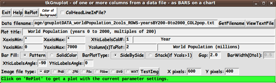
Experimenting with the GUI

As in all my scripts that use the 'pack' geometry manager (which is all of my 100-plus Tk scripts, so far), I provide the four main 'pack' parameters --- '-side', '-anchor', '-fill', and '-expand' --- on all the 'pack' commands for the frames and widgets.

I think I have found a good setting of the '-side', '-anchor', '-fill', and '-expand' parameters on the 'pack' commands for the various widgets of this GUI.

In particular ...

The filename, plot-title, and axis-titles entry widgets expand/contract appropriately when the window size is changed --- and button and label widgets stay fixed in size and relative-location as the window size is changed.

Furthermore, radiobuttons, the checkbutton, and entry fields for axis-limits, column numbers, gap-width, bar-width, pixel-sizes, etc. stay fixed in size.

If anyone wants to change the way the GUI configures itself as the main window size is changed, they can experiment with the '-side', '-anchor', '-fill', and '-expand' parameters on the 'pack' commands for the various widgets --- to get the widget behavior that they want.

---

Additional GUI experimentation:

You could change the fonts used for the various GUI widgets.

For example, you could change '-weight' from 'bold' to 'normal' --- or '-slant' from 'roman' to 'italic'.

Or change font families.

In fact, you may NEED to change the font families, because the families I used may not be available on your computer --- and the default font that the 'wish' interpreter chooses may not be very pleasing.

Furthermore, there are variables used to set geometry parameters of widgets --- parameters such as relief-type, border-widths, and padding.

Feel free to experiment with those parameters as well.

---

Note that the 'Color' button calls on an RGB color-selector-GUI script to set the colors.

You can make that color-selector script by cutting-and-pasting the code from the page offering 'a non-obfuscated color selector GUI', on this site.


Some features of the code

There are plenty of comments in the code to describe what most of the code-sections are doing.

See the 'PROCS' section of the code to see the code in all the procs that are used in this Tk script.

Here is a list of the procs in this Tk script:

  • get_filename
  • view_file
  • replot
  • edit_inputs
  • enable-or-disable_bar-and-gap-widths
  • display_test_img
  • getset_color
  • update_color_button
  • popup_msgVarWithScroll

The main plotting code is in the 'replot' proc.

See the comments in that proc for details on how the plotting is implemented by creating a 'gnuplot' script of commands to pass to the 'gnuplot' program.

Although it may sound like stating the obvious, it is probably worth mentioning that the 'get_filename' proc is called by the 'GetFilename' button --- and the 'replot' proc is called by the 'RePlot' button --- and the 'getset_color' proc is called by the 'Color' button (and any future color buttons that might be put on this GUI).

The 'update_color_button' proc is called near the bottom of the Tk script to initialize the GUI, after initializing some color variables.

And that 'update_color_button' proc is also called in the 'getset_color' proc.

Just a few more comments on some 'features' of this script:

  1. EditInput:

    The 'edit_input' proc is called by the 'replot' proc to check the entries on the GUI --- that they are the proper numeric type, in the proper range, etc.

    If there is an exception, the 'popup_msgVarWithScroll' proc is used to popup a message to the user.

    The 'popup_msgVarWithScroll' proc is also called by the 'Help' button to show the text in the 'HELPtext' variable, which is set at the bottom of the script.

  2. Output Display:

    'gnuplot' typically renders the plot into an output file in a fraction of a second.

    Some 'viewer' variables are used in this Tk script to set the viewer program to use for the various output file types.

    I have set the viewer variables as follows:

    • set GIFviewer "/usr/bin/eog"
    • set PNGviewer "/usr/bin/eog"
    • set JPGviewer "/usr/bin/eog"
    • set PSviewer "/usr/bin/evince"
    • set SVGviewer "/usr/bin/inkscape"

    where 'eog' is the 'Eye of Gnome' image file viewer utility.

    'evince' is a PDF and Postscript file viewer.

    Inkscape is an SVG editor. Inkscape is slow to open.

    It might be just as fast to use a web browser, like Firefox, as the SVG viewer.


Comments in the Code

It is my hope that the copious comments in the code will help Tcl-Tk coding 'newbies' get started in making GUI's like this.

Without the comments, potential young Tcler's might be easily frustrated and be tempted to return to their iPhones and iPads and iPods --- to watch videos of migrants fleeing Syria --- and thinking 'There, but for the grace of the Universe, go I'.


The Tcl-Tk CODE

Here is a link to CODE for the script 'tkGnuplotXY_BarChart_fromFile.tk'.

You may find it instructive to see the variables set, in an 'Additional GUI Initialization' section near the bottom of the Tk script --- above the setting of the 'HELPtext' variable at the very bottom of the script.

That section is where you can reset the viewers to be used, and change the middle-names and directory locations for the output files (gnuplot script and image files).

The 'HELPtext' variable is set at the bottom of the script so that it can display the values of some of the variables that were set --- for example, the filename that was set for the output 'gnuplot' script file --- and the 'filename-prefix' that was set to be used in creating the name of an output gif/png/jpg/ps/psbw/svg file.

Of course, if you need to change a directory name or want to change a middle-name for these files, you can simply change the 'set' statements that affect those names.


Sample Data Files   (for bar charts)

At the bottom of the Tk script (in the 'Additonal GUI Initialization' section), you can see several 'if' clauses that were used to start up the GUI on 3 different test data files.

In case you might want to allow the GUI to come up with one of those 3 filenames in the filename entry field, I provide the three data files here.

They can be used as examples of how to format your own data files.

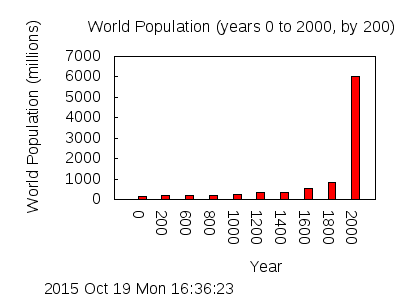
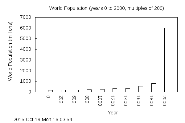
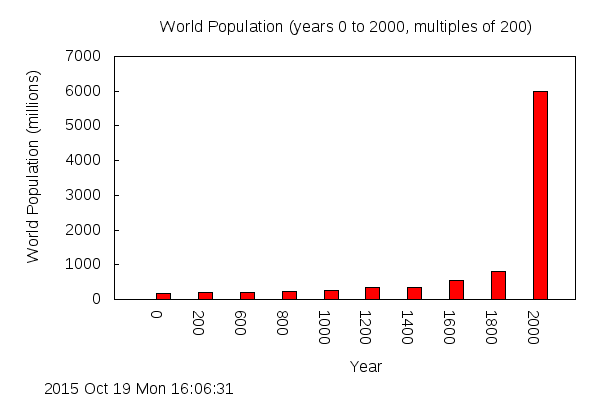
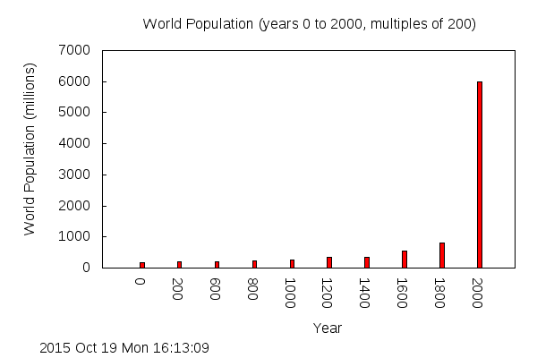
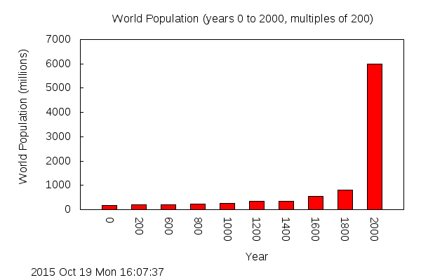
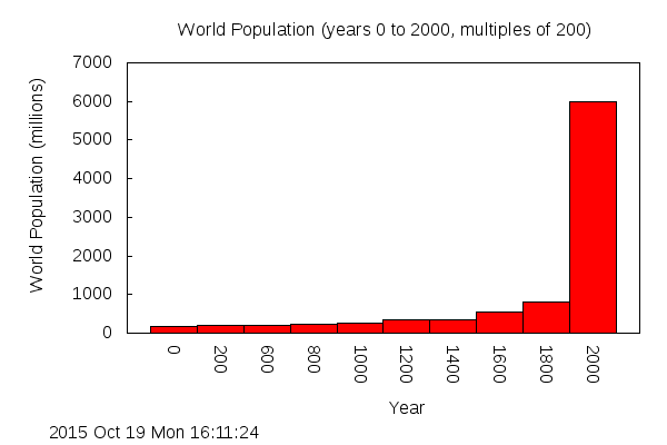
'gnuplotDATA_worldPopulation_2cols_ROWS-yearsBY200-0to2000_COL2pop.txt'.

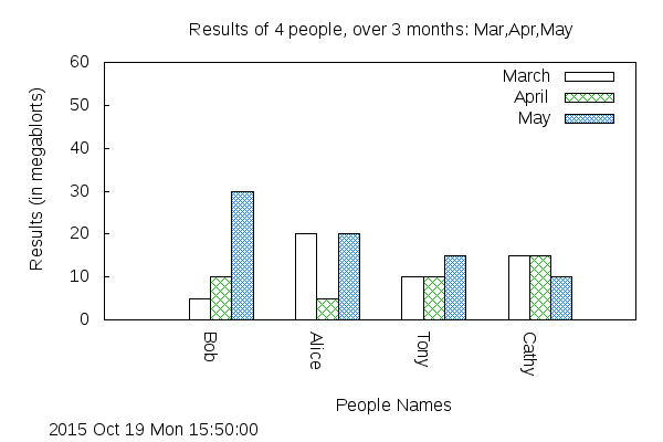
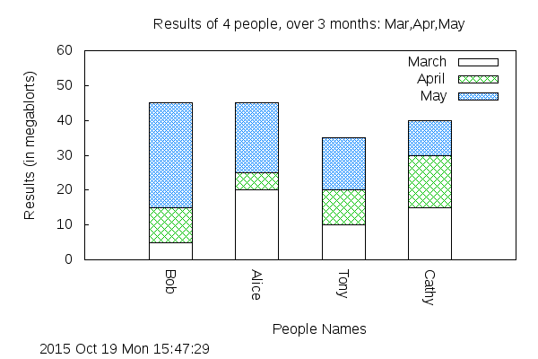
'gnuplotDATA_peopleResults_4cols_ROWS-4peopleNames_COLS2to4-months.txt'.

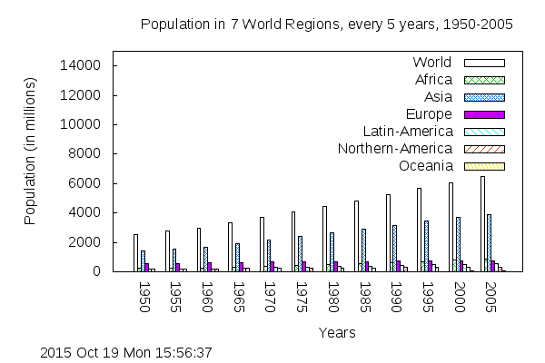
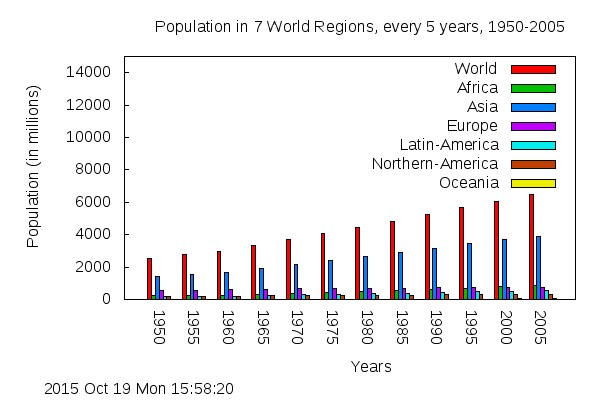
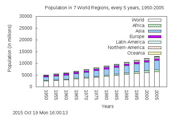
'gnuplotDATA_populations_8cols_ROWS-yearsBY5-1950to2005_COLS2to8-regions.txt'.

Note that the latter two files have a 'header' line in the file (the first non-comment line) that can be used to extract names for a 'key' (legend) on the plot.

With these files, you will want the 'ColHeadLineInFile?' checkbutton at the top of the GUI turned ON.

    Of course, these two 'populations' files contain data for populations of humans.

    Data for other mammalian species is hard to come by --- since rhinos and elephants and lions and tigers do not pay taxes --- so there has been no motivation over the past 2,000 years or so to conduct censuses to determine how many of them exist, and where they exist.

    It can safely be said that a graph of the populations of rhinos and elephants and lions and tigers would show almost exponential decline --- in contrast to the more than exponential growth in the human population.

    Unfortunately, the exponential growth in the human population is, no doubt, the cause of the drastic decline in the population of 'wild-mammals'.

    Cows, pigs, sheep, and goats are the best chance of finding data on mammalian populations --- since humans eat them.

    And horses, since humans ride them and bet on them.

    And dogs and cats, since humans nurture them as pets.

    But it appears that since they don't pay taxes either, it is not so easy to find good data on their populations --- worldwide or in certain countries.

    In some countries, some pretty good data might be available for the past 50 years, but before 1950, not so much.

    I looked for tiger, lion, elephant, rhino, gorilla, etc. population data, but it just does not seem to exist.

    Probably what little exists is at relatively small geographic locations (less than nation-wide).

    If I ever find any good data on the populations of these declining species, I intend to supply data files in these 'PLOTtools' pages.

    Unfortunately, it looks like these species will be gone (except for pictures on the internet), and we will never have had any good population data on them.


Other 'gnuplot' utilities

This is the fourth of several 'gnuplot front-end' utilities that I plan to write.

Other Tk 'gnuplot front-end' scripts that may follow are:

  1. a 'pie plot' utility done with 'gnuplot'.

    (Although some web pages, including a 'gnuplot' FAQ page, say that this is not possible with gnuplot, several people have posted examples of how to get pretty nice looking pie plots with 'gnuplot'.

    A method using the 'splot', surface plot, command works even with older versions of 'gnuplot', such as version 4.2.)

  2. a many-y-values xy-plot, created by selecting many columns of data, say, up to 10, from a text file containing columns of data --- extracting text-strings from a header line in the file, strings that are names that can be used for a plot 'key' (legend) for the many lines on the plot.

  3. 2D and 3D plots of selected portions of a 'gnuplot' 'world.data' file --- or 'off-shoots' of that file --- showing continent (and maybe country) outlines --- in a global or local view --- in spherical or planar (or cylindrical) coordinates.

    (With the 'wxt' terminal output from the 'splot' command, the mouse can be used to rotate a surface plot --- for example, a spherical globe with an outline map on it --- in the 'wxt' terminal window.)

  4. 'parametric' 3D plots --- to greatly expand on the types of surfaces that can be plotted compared to the restricted surfaces that can be plotted with the z=f(x,y) utility.

  5. 'parametric' 2D plots --- plots of lines, like spirals, in an xy plane


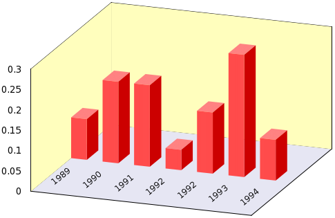
Sample Bar Chart 'Runs':

Below is output from one of my test bar chart runs.


This is a GIF file bar chart of world population data.

At first, I used the same world-population data file
that I used for the 'tkGnuplotXY_2or3colsFromFile' utility,
where the x values are years.

However, since the x-values in the file were not
evenly-spaced, the resulting bar plot was distorted
in the x-direction and gave a misleading view of the
rate of population growth.

So I used the data from that file for the years
divisible by 200: 0, 200, 400, 600, ..., 1800, 2000.

The plot above is a 'pattern fill' plot.

Since the first pattern that 'gnuplot' uses is an empty pattern (no hatch lines), these bars look rather plain.


After doing the plot above, to get this GIF file
bar chart with color-filled bars, I simply
clicked on the 'SolidColor' radiobutton
and then clicked 'RePlot'.

The plot image above is a large-sized image, similar to the reduced-size image at the top of this page.

I found that I could not get a good quality image by simply scaling down this 600x400 pixel plot --- whether I used a GIF or a PNG file.

So I did a plot requesting 400x300 output. This revealed a possible need to supply some font-choosing widgets on the GUI, because I had to abbreviate the plot title to get it to fit on the 400x300 pixel plot at the top of this page.


After doing the plot above, to get this GIF file
bar chart with narrower bars, I simply changed
the GapWidth entry field from 2.0 to 8.0
(increased the gap) and clicked 'RePlot'.

This is a 'gnuplot' 'cluster' plot, but
with only one bar per cluster.

So you see that the gap-width parameter,
that is used to determine the
spacing between 'clusters of bars', can be
used to make 'gnuplot' reduce the width of
the bars in these 'single-bar-clusters'.


For this plot, 'SideBySide' was changed to 'Stacked'
and the default bar-width of 0.5 was used.

You see that when there is only 'one-bar-per-cluster'
(in other words, only one y-column of data was
specified for the plot), a 'Stacked' plot
looks pretty much like a 'SideBySide' (clustered) plot.


For this plot, the bar-width was changed to 1.0
--- demonstrating that when you use a (relative)
bar-width of 1.0, the bars are plotted with
their sides touching.

Plots from a 2nd Sample Data File follow.

These are plots of 'Results' (in 'megablorts') versus 'People names'.


Here is a plot from the 2nd sample data file above,
in which there was a header line over the columns of data
--- columns that corresponded to months Mar, Apr, May.

The rows of data in this file corresponded
to the names Bob, Alice, Tony, Cathy.

In fact, those names are in the first column,
and that is the column that was
specified as the column from which to
get the tic-mark labels for the x-axis.


After doing the plot above, to get this
'stacked' bar chart, I simply clicked on the
'Stacked' radiobutton and then clicked 'RePlot'.

Plots from a 3rd Sample Data File follow.

This is population data versus years (multiples of 5 years) --- for seven regions of the world.

Clusters of seven bars are plotted at each year --- corresponding to the seven regions.


Here is a plot from the 3rd sample data file above,
in which there was a header line over the
columns of data --- columns that corresponded to
regions of the world, or the entire world.

The 1st column contains years (at 5 year intervals),
and that column was specified as the column
from which to get the tic-mark labels for the x-axis.


After doing the plot above, to get this plot
with solid-color-filled bars, I simply
clicked on the 'SolidColor' radiobutton
and clicked 'RePlot'.

'Pattern' versus 'Solid Color' bar plots

Since I am partially color-blind, I find it hard to distinguish parts of plots that were meant to be distinguished by their colors.

It was especially meaningful to me when I saw that Philipp Janert, in his book 'Gnuplot in Action', related this little story, on page 168:

    When I was a first-year graduate student, I once did an experiment involving a red laser and a green laser. I plotted the results (naturally enough) in red and green.

    (On paper. With colored pens. Using special, expensive logarithmic plotting paper. This story doesn't predate gnuplot, but it does predate generally available color printers.)

    When I showed the graph to one of my professors at the time, he took a look and asked, "Which line is for the red laser?"

    I responded, somewhat snottily, "Well, the red line is for the red laser and the green one for the green one, of course." (Duh!)

    He looked at me and said, "I'm color blind." Oops.

This is from Chapter 9 'Color', in section 9.3 'Using color for data representation'.

On page 164, Janert urges "Never, ever, publish a false-color plot without showing the mapping of numbers to colors explicitly."

For the 10 to 15% of the population that is (partially) color blind (usually red-green challenged), it would be a great help if numbers were used with colors --- OR if patterns were used instead of colors.

I see color diagrams all the time that I have a hard time interpreting, because I am partially red-green blind.

In fact, I all too often see color plots and diagrams that are 'lost on me'.

The colors in the plot above, however, are distinct enough that I can manage.

For these reasons, the fill-type 'Pattern' is the default on this GUI, rather than 'SolidColor'.

For people who cannot distinguish colors well, the patterns are a great help.


After doing the pattern plot above, to get this plot
with 'stacked' bars, I simply clicked on the
'Stacked' radiobutton and clicked 'RePlot'.

(I had to increase the Y-axis max so that
the bars on the right did not overlay the legend
--- the 'key' in 'gnuplot' terminology.)

'SideBySide' versus 'Stacked' bar plots

Here is another observation by Philipp Janert, in his book 'Gnuplot in Action', an observation that struck a chord with me. On page 294:

    "The main take-away from this example [some line plots were presented] is that stacked graphs easily hide trends in component parts of aggregate numbers ..."

This was from Chapter 14 'Techniques of graphical analysis', in section 14.3 'Changing appearance to improve perception'. In that section, he points out that stacked graphs can be a good idea if we're only interested in the cumulative sums, but not the constituent parts of the stacks.

Janert also points out that with stacked graphs, you also get into issues with the sort order of the stacking.

A poor sort order can make it even harder to draw conclusions from the graph.

He points out that "it's best to place the components with the least amount of variation first, to preserve the stability of the baseline as much as possible."

If there are no such 'low-variation' components, then it is a pretty sure thing that a stacked graph should not be used.

For these reasons, the plot-type 'SideBySide' is the default on this GUI, rather than 'Stacked'.


My main conclusion from these sample plots was:
This GUI really speeds up the amount of 'experimenting-per-minute' that you can do with 'gnuplot' bar plots.


Future Enhancements:

I have not tested this script extensively.

No doubt, if I use it some more, I will find a few things to change, add, or fix.

I know the GUI is very 'busy-looking'.

See my comments on busy (and extremely non-busy) GUI's, near the bottom of the 'tkGnuplotXY_upto3mathExpressions' page of this site.

Like in a couple of other of these 'tkGnuplot' scripts, I may add an 'Autoscale' button.

Then, after doing some experimenting with various axis limits, the user can quickly go back to 'autoscale' mode by clicking the 'Autoscale' button.

An asterisk is then to be put into the 4 min,max entry fields.

I may also provide a 'ClearFilename' button.

I may provide widgets on the GUI to select a font size (and font family) for the text in the plot.

The 'gnuplot' default font size is 12 points.

Sometimes, it may be helpful to use a smaller font-size, to get text, such as long titles, to fit onto the plot.

I may need to add (or revise) some input checks in the 'edit_input' proc ... someday.

Furthermore, as I point out at the bottom of the 'HELPtext', someday I may try to get more appealing plots --- with color gradient backgrounds --- and better-quality bar plots --- by using some of the 'gnuplot tricks' of Zoltan Voros, that can be seen at 'www.phyast.pitt.edu/~zov1/' in

In case those pages disappear, below is one of several images from Zotan's bar graphs page.

This image shows what Zoltan was able to achieve --- using some tricky 'gnuplot' commands:


A 3D bar chart plot done by Zoltan
with clever 'gnuplot' commands.

This just goes toward showing :

There is just no end to what can be done, to enhance almost any utility.


Sample gnuplot script:

Here is the gnuplot script file that was created in one of my test runs.

See the 'plot' line near the bottom.


    #!/usr/bin/gnuplot ! cd /tmp set terminal png size 400 , 300 nocrop noenhanced butt xFFFFFF x000000 x000000 set output '/tmp/${USER}_temp.png' set title 'World Population (years 0 to 2000, by 200)' set timestamp '%Y %b %d %a %H:%M:%S' set xlabel ' Year' set ylabel ' World Population (millions)' set style data histogram set style histogram clustered gap 2.0 set style fill solid 1.0 border -1 set xrange [ * : * ] set yrange [ 0 : 7000 ] set xtics rotate by -90 set ytics rotate by 0 set xtics nomirror set ytics nomirror set nokey set nokey plot '...filename goes here...' using 2:xticlabel(1) ! /usr/bin/eog /tmp/${USER}_temp.png &

This is pretty crisp and clean, compared to all the comments that I have around the Tcl-Tk code that is writing out these gnuplot commands.


Note that by using the Tk GUI, the user can typically avoid having to page back and forth through 'gnuplot' documentation trying to find commands to use and the proper syntax for those commands --- and which parameters to use with those commands.

And the user avoids many syntax errors, because I filtered out the errors that I made during testing, resulting in gnuplot commands that are probably going to work --- with gnuplot 4.2 and thereafter.

A major part of a user's documentation searching and syntax debugging is eliminated by use of this Tk GUI.

Bottom of this web page for
presenting Tcl-Tk code for a
'tkGnuplotXY_BarChart_fromFile' app
--- a plot utility in the FE 'tkGooies' system,
in the 'PLOTtools' group.

To return to a previously visited web page location, click on the Back button of your web browser a sufficient number of times. OR, use the History-list option of your web browser.
OR ...

< Go to Top of Page, above. >

Page history:

This FE web page was created 2015 Oct 19.

Page was changed 2019 Mar 05.
(Added css and javascript to try to handle text-size for smartphones, esp. in portrait orientation.)

Page was changed 2019 Jun 24.
(Specified image widths in percents to size the images according to width of the browser window.)


NOTE:
This code and description has not been posted on a Tcler's Wiki page --- at wiki.tcl-lang.org --- formerly wiki.tcl.tk. If I ever do so, I plan to add a link to that page here --- as a backup and alternative to this page.